| Geopolitics | Population | Food | Development | Environment | Home |
| Geopolitics | Population | Food | Development | Environment | Home |
| Glossary | Atlas | Search | Discussion | News |
Scattergraphs like the one below are used to help determine whether there is a relationship between two factors. In this case, is there a relationship between Life Expectancy and the number of Doctors per 10,000 population ?
Look at the scattergraph for the following data and answer the following(not to be submitted for marks):
1) What pattern do the dots create ? (are they randomly scattered, clustered, or located along a general direction?)
2) What relationship between the two factors (Life Expectancy and Doctors) does this graph appear to show ?
3) Egypt and Japan have close to the same number of doctors per 10,000 population, yet life expectancy for the Japanese is significantly longer. What factors might explain this ?
Life Expectancy and Doctors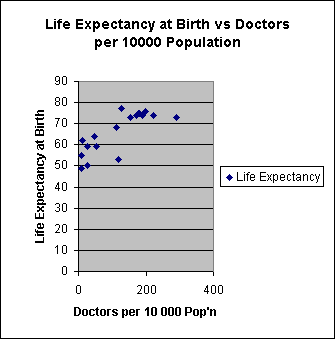
| Country | Doctors per | Life Expectancy |
| 10,000 Pop'n | at Birth | |
| Sweden | 198 | 76 |
| Saudi Arabia | 221 | 74 |
| USA | 191 | 74 |
| France | 172 | 74 |
| Canada | 182 | 75 |
| Australia | 179 | 75 |
| Japan | 128 | 77 |
| UK | 153 | 73 |
| Italy | 290 | 73 |
| Venezuela | 113 | 68 |
| Brazil | 53 | 59 |
| Mexico | 47 | 64 |
| Nigeria | 9 | 49 |
| Philippines | 13 | 62 |
| Egypt | 119 | 53 |
| Pakistan | 28 | 59 |
| India | 28 | 50 |
| Bangladesh | 9 | 55 |